The post Bootcamp: Lorenzetti’s Allegory of Good and Bad Government appeared first on &.
]]>For this bootcamp, I wanted to see what Moretti’s network theory could bring to my own research, and more specifically to the interpretation of visual texts related to law and justice.
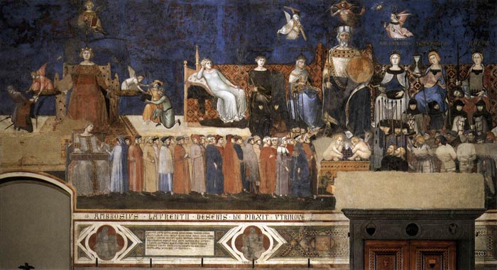
I chose to look at a group of three 14th century frescoes painted by Ambrogio Lorenzetti: the Allegory of Good and Bad Government, located in the Town Hall of Siena. Since they are fairly complex paintings containing numerous characters, I thought that a diagram might be useful to shed light on the relations between the symbols. I first focused on the main central fresco. Since I still feel more comfortable with paper and pencil than with fancy software, I did it granny style.
 In this diagram, the nodes are obviously the characters in the allegory, and the edges represent the connections between them. I simplified things a little bit, leaving aside for instance the soldiers and prisoners in the right lower corner.
The diagram makes evident some connections that the viewer of the fresco could easily miss if he or she didn’t pay close attention to the details. The cord that is handed down from the scales (held by Justice) to the People is, in fact, a fairly explicit edge. But there are a number of additional and more implicit connections between the characters that the diagram reveals. For instance, Justice is connected to Good Commune, but only indirectly: the link passes through the People. According to a common interpretation made by contemporary art historians, it runs from Justice, via harmony (Concordia) through the People, which are thus both guided and held in check, to Good Commune. But looking at the diagram, one could ask whether the direction of this edge could be reversed, running from Good Commune to Justice. In other words, the diagram incites us to ask more fundamental questions with respect to power relations.
Another set of relations revealed by the diagram is the one concerning the six virtues sitting around Good Commune. They are all connected to Good Commune, but not to each other, and also not to the main Justice figure to the left. The diagram also highlights the fact that Justice appears twice in the same fresco, and that the two representations are not directly related to each other. Does this duplication imply that justice was the dominant virtue at that time? Interestingly, the main Justice figure to the left is the only character related to Wisdom. This suggests that wisdom was, in the 14th century, considered essential to deliver justice but, since the node of Wisdom is not directly related to the node of Good Commune, not fundamental to the exercise of good government itself.
As Moretti suggests, we can also make experiments by playing with the diagram; variations may indeed be enriching. I didn’t re-draw the diagram in each case, since, thanks to Moretti’s own experiments, it’s quite obvious how this would look like in our case. What happens if we remove one of the virtues? Or if we get rid of the main Justice figure to the left? How would then good government be exercised? Remember that Wisdom disappears with the removal of this Justice. And what about if we eliminate the People? It is, after all, the very purpose of Justice and of Good Commune that would disappear. What would be the effect of getting rid of the central fresco? How do the allegory and effects of bad government (the fresco to the left) relate to the effects of good government (the fresco to the right)?
Notwithstanding these insights, there are important shortcomings to using network theory to analyze relations between numerous characters and symbols in an artwork. By way of example, the analysis of how the nodes are linked by the edges in Lorenzetti’s allegory has not revealed totally unexpected relations. This is probably linked to the fact that my analysis, similar to Moretti’s analysis of Hamlet, misses vast quantities of data; these frescoes clearly don’t contain large groups of objects necessitating quantitative analysis. Moreover, although not as explicit as a diagram, the frescoes are already visual representations.
We also have to be careful when trying to draw, from these frescoes, definite conclusions that are then converted into the diagram. Interpretation plays an important role. In the 18th century, for instance, the figure sitting on the throne to the left was thought to represent the city of Siena, and not Justice. And initially, the group of frescoes was called Peace and War; it’s only centuries later that the name changed, when good government itself became an important notion. In other words, there are alternative ways of reading these frescoes, something that the diagram does not reveal.
Furthermore, the diagram does not allow us to comprehend the overall symbolic importance attached to good government. There are two entire frescoes dedicated to good government (the allegory of Good Government and the Effects of Good Government), whereas bad government gets only one fresco combining the allegory and the effects. The frescoes are located in the room where the city councilors met; these frescoes were obviously meant to remind them of the consequences of their decisions and to influence them in a positive way (therefore the greater importance given to Good Government). But am I too concerned with close reading here?
Finally, I am wondering whether the conception of justice and of good government more generally is well represented in a diagram. It probably works in this European context, in other words in a context infused by Western thought. Following the discussion in Deleuze and Guattari, it could be speculated that in other cultures, justice might be better represented by other visual tools, as a tree or a rhizome, for example.
To try to gain more insights from applying network theory to my research, I thought I should expand my initial diagram. I therefore tried to represent the links between the three frescoes in another, even more simplified, diagram.
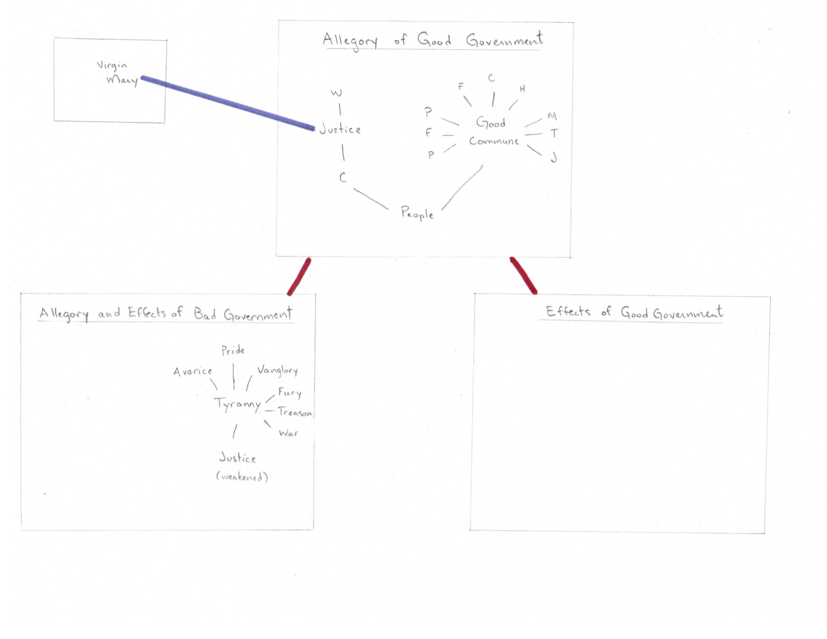
Hmmm. There are certainly many links to be made between the nodes in the different frescoes – an obvious one would be between the “strong” Justice figure in the central fresco and the “weak” Justice figure in the fresco to the left. But somehow I feel that it would be too arbitrary to try to make all these connections. Although there are definite connection between the frescoes, i.e. between the Allegory of Good Government and its Effects, only the fresco to the left contains further allegories and therefore more easily identifiable nodes.
Moreover, there are other paintings related to these three frescoes. There is, for instance, a painting of Virgin Mary in an adjoining room that is usually seen as being connected to the main Justice figure in the central fresco. The resulting interpretation is that the two women – Justice and Virgin Mary – are seen as reigning over the city of Siena. What about other paintings in the City Hall, and elsewhere in the city of Siena?
I would say that although its usefulness is very limited, the second diagram reminds us, once again, that making diagrams involves a lot of subjectivity and interpretation.
In sum, I believe that a few interesting connections and insights have emerged from drawing these diagrams of the Lorenzetti’s group of frescoes. But I am still not convinced of networks as an appropriate re-visualization style of representations, such as paintings and photographs. I certainly need to rethink how exactly Moretti’s network theory could be more helpful and meaningful in this context, and how an analysis of quantitative data could complement the more qualitative interpretation of visual representations.
Bibliography
Deleuze, Gilles, and Felix Guattari. “Introduction: Rhizome.” A Thousand Plateaus: Capitalism and Schizophrenia. Trans. Massumi, Brian. Minneapolis: University of Minnesota Press, 1987. 3–25.
Dessi, Rosa Maria. “L’invention du « bon gouvernement » – Pour une histoire des anachronisms dans les fresques d’Ambrogio Lorenzetti (XIVe-XXe siècle).” Bibliothèque de l’École des chartes 165 (2007) 453-505.
Moretti, Franco. “Network Theory, Plot Analysis.” Literary Lab Pamphlet 2. May 1, 2011. [Orig. pub. New Left Review 68, March-April 2011]. http://litlab.stanford.edu/LiteraryLabPamphlet2.pdf.
The post Bootcamp: Lorenzetti’s Allegory of Good and Bad Government appeared first on &.
]]>The post Bootcamp: The relative emptiness of maps appeared first on &.
]]>Maps themselves are also texts (Harley: 7-8). As raw material, I decided to take a map showing the projects and infrastructure planned to implement the (in)famous Plan Nord of the Charest government. The project, now called Le nord pour tous, hasn’t changed much under the new government, although its implementation has been somewhat slowed down due to the situation of the global economy.

My idea was to re-contextualize this map and to try to make sense of the territory through a native’s eye. How would a “traditional” native map of this territory, or part of it, have looked like? Perhaps like this?

A “traditional” native map challenges the European valuation of land and associated property claims. Space is organized very differently; it is more important to position people in, in relation to, and because of, the landscape (Anker: 112), than to reproduce exact and measurable graphic features.
The potential is there, but I realized that I would probably be speculating too much. I am, of course, a white woman (let’s forget my great-great Abenaki grand-ma – or what is my great-great-great grand-ma?) from the South, not knowing much about the North, not knowing enough about native Weltanschauung, nor about what a “map” might traditionally mean to a native person. Consider that before the arrival of the Europeans, Indian and Inuit languages did most likely not contain a word for “map”. So even the expression “native map” or “traditional map” has a colonialist touch. Moreover, I should probably not have drawn this “map” on a bleached and perfectly white sheet of paper (it’s recycled paper and may therefore be considered more “ecological”, but it’s most likely not “ecological” in any traditional native sense), but rather on a bark.
I ended up fearing that I would have to make a very long list of disclaimers, and that my “map” could be interpreted as a child’s drawing, or as making fun of or denigrating the lifestyle and intellectual capacities of native people.
I therefore changed my approach and tried to imagine how the first European explorers visualized the territory to be discovered. How did they map Quebec? How did they start? Perhaps like this?

Rather empty, right? That’s it, an empty space.
Since the first explorers didn’t know much about the territory (and did of course not think in terms of the political space that Quebec forms today), the “map” of Quebec should perhaps rather look like this:

Completely empty. Only a frame, an artificial frame, in which the map-drawer can inscribe whatever he or she (in that time, probably he) wants. The blank sheet, however, stands for the “potentiality, the yet unwritten laws and yet unrealized power” (Goodrich: 91). It becomes a representation of space but a space of representation (Siegert: 13).
Whether it’s the coastline, forests, mountains, rivers, native settlements, the movement of animals, mines – the map-drawer has the power to determine the scale, the focus, the relationship between the objects represented, in short to appropriate the terra nullius, the territory that is socially and legally constructed as belonging to “nobody”.
While every map, of course, starts with a blank sheet, or a bare skin, or a plain rock, the empty map in the context of a colonialist endeavor embodies the constructed emptiness of the space. In this sense, I believe that an empty, or nearly empty map of the North of Quebec is revealing of the ways in which the European settlers treated, and still treat, this territory.
Such a “map” does not reply to any questions or explain anything by itself, but it is a good way to ask different and more fundamental questions. As Moretti writes, a map “shows us that there is something that needs to be explained.” (Moretti: 84)
Work cited:
Anker, Kirsten. “The Truth in Painting: Cultural Artifacts as Proof of Native Title.” Law Text Culture 9 (2005) 91-124.
Goodrich, Peter. “The Iconography of Nothing” in Douzinas and Mead, eds, Law and the Image. Chicago: Chicago University Press, 1999, 89-115.
Harley, J.B. “Deconstructing the Map.” Cartographica 26:2 (Summer 1989) 1-20.
Moretti, Franco. “GRAPHS, MAPS, TREES: Abstract Models for Literary History – 2.″ New Left Review 26 (March/April 2004): 79–103.
Ryan, Simon. The Cartographic Eye – How Explorers Saw Australia. Cambridge: Cambridge University Press, 1996.
The post Bootcamp: The relative emptiness of maps appeared first on &.
]]>The post Probe – An archeology of vernacular photography appeared first on &.
]]>
The above picture is a detail of a collage currently on exhibition at the Darling Foundry and is part of Le Mois de la photo à Montréal. The artist transformed and assembled close to one thousand images taken from a photo-sharing website.
Sunset Portraits is a large, yet ordered and neat collage. The pictures are all the same size, similarly cropped, and were likely printed using the same devices and techniques. The background colors are well distributed, which adds to the overall sense of harmony. The images in this installation physically touch each other (isn’t this a nice metaphor for surface relations?).
But of course, these images relate to each other in various ways, both on Flickr, from where the artist extracted her pictures from a pool of millions of sunset images, and in the art work Sunset Portraits. In both instances, they are part of a discursive practice; their production and circulation take place according to certain rules of formation that remind us of Foucault’s discourse analysis.
The artist behind Sunset Portraits, Penelope Umbrico, is not interested in the meaning of the individual images that make up her collage: “[m]y focus on collective practices in photography has led me to examine subjects that are collectively photographed. I take the sheer quantity of images online as a collective archive that represents us – a constantly changing auto-portrait. … The idea of absence and erasure is a constant theme in my work, especially with regard to the popular uses of technologies in photography and on the Internet that seem to promise visibility, community and intimacy. I question the idea of the democratization of media, where pre-scripted images, made with tools programmed to function in predetermined ways, claim to foster subjectivity and individuality” (http://www.penelopeumbrico.net/Info/Words.html).
Looking at a single sunset portrait would not reveal much; however, paying attention to the group of images, does. The origin, place and time of the photos are not essential pieces of information. Amplified by the symmetrical collage, the similarity of the images becomes almost mechanical, making each individual image redundant. “The lack of individuality that is ultimately the experience when faced with so many assertions that are more or less all the same”, as Umbrico herself says, becomes even more obvious because of the artist’s selection of – technically speaking – “bad” pictures, taken against the light and showing mainly undistinguishable faces. Through her re-grouping and alteration of images in a schematic collage, she has flattened the images to bring the viewer to think about how the images relate to each other. Her method of identifying and putting together similar images from Flickr attempts to make sense of the contemporary mass phenomenon that consists of taking pictures and sharing them on the Web. In other words, as I would argue, she is looking at what Foucault calls the discourse, and she invites the viewer to consider this discourse “in the play of its immediacy” (Foucault 1998: 306).
Both Umbrico herself and the viewer of Sunset Portraits are likely not concerned with the question of whether photography is an interpretation of the world (Rancière 86) or whether Susan Sontag is right when she affirms that “[t]o photograph … means putting oneself into a certain relation to the world that feels like knowledge…” (Sontag 4). How can the almost banal and individual – yet at the same time collectively repetitive – act of making sunset portraits be an interpretation of the world? How do they allow us to relate meaningfully to the world? But let’s not talk too much about “deeper” meanings – Foucault would, in any event, have rejected a psychoanalytically informed analysis of these images. It is not the act of photographing that is relevant here, but rather the fact that this act and the subsequent sharing of these images are part of a discursive practice governed by certain rules of formation and circulation.
These visual discourses therefore do not primarily exist because photographs capture experience (Sontag 3-4), but because they exercise other functions. Indeed, it appears to be more important to take sunset pictures according to particular standards and share them on the web as a means for bonding (van Dijk 62), than to create an individualized picture that functions as a memory tool.
It’s worth noting that Umbrico, just like Foucault, does not seem, in a structuralist sense, to be overly interested in the “formal possibilities afforded by a system” (Foucault 1998: 289), which could be seen here as all the possibilities of image-making and image–sharing. Umbrico rather helps us locate the “various regularities” that the formation of this kind of visual discourse obeys (Foucault 108).
How and why do these images relate to each other? Although each image posted on Flickr cannot be considered a statement by itself, the assembled group of images featured in Sunset Portraits represents a system. It is a system in which statements are associated with rules that govern the production and circulation of images. Foucault would argue that it is precisely this system, composed of statements that define and limit, which ultimately unites the images. These statements are to be associated “with the rules governing the particular field in which they are distributed and reproduced” (Deleuze 4).
Umbrico’s collage thus makes the viewer think about “the rules put into operation through a discursive practice at a given moment that explain why a certain thing is seen (or omitted)” (Foucault 1996: 52). What is typically included in such images, and what or who is excluded – what is part of the discourse, and what is not? Elderly people, babies, people with disabilities, and families are not associated with the typical sunset picture. There are not many (none at all?) black people in Umbrico’s work. Is the heterosexual couple the ideal subject for a sunset portrait? In other words, are these images, and more generally our individual freedom, pre-scripted?
We therefore have to ask what are the statements at play that make millions of people take and post strikingly similar pictures. Is it the widespread impulse to share one’s life on the web, combined with the ongoing importance of romantic love in the ‘Western’ world? Sunsets are perceived as beautiful and romantic, ideally experienced on vacation with a loved one by the ocean. Romantic sunset pictures hence also become marketable. Some discourses thus get sidelined because of a dominant discourse, as illustrated by Sunset Portraits. Foucault would probably echo Umbrico’s critique of this form of power that installs itself unconsciously and unintentionally.
“Finding” images on the web and creating a new sign system out of them, as Umbrico does in her work, also raises the question of originality: who produces this discourse? The assembled images acquire, in Umbrico’s words, “meanings different from those intended by the photographer or the original publisher of the image” (http://www.moisdelaphoto.com/umbrico_en.html). Where do we begin our inquiry? Should we at all be concerned with locating the origins, the source?
When writing about photography, it is quite common to talk about the development and evolution of photography, from the daguerreotype in the first half of the 19th century to digital photography in the early 21st century. Over time, the uses of photographs have changed, and nowadays almost anyone can take and collect pictures and share them on the Web. We might wonder, methodologically speaking, what the point is of going back, of trying to “retrace the discourse to the remote presence of its origin” (Foucault 1998: 306), to find the ‘absolute beginning’. Are we reluctant to speak of ‘relative beginnings’ because we have to position ourselves in relation to them, because we believe that we must justify the choice of such a relative beginning?
According to Foucault, there are always multiple points of origin. This might explain why Umbrico does not necessarily attempt to reveal the continuity or discontinuity over time of taking and sharing pictures, choosing instead to emphasize the here and now. Another collection of photos she made also illustrates this and adds another layer of complexity. Here, people are photographed while standing in front of her collage Suns, which was also created from photos posted on Flickr.

Not knowing or being concerned with the precise history of an image or a written text may represent an opportunity rather than a shortcoming. It allows one to appreciate the present, describe surface relations, and understand the formation and functions of discourses.
—
Note: Flickr is “a collaborative experience: a shared display of memory, taste, history, signifiers of identity, collection, daily life and judgment through which amateur and professional photographers collectively articulate a novel, digitized (and decentralized) aesthetics of the everyday” (Murray 149).
Works cited:
Deleuze, Gilles. “A New Archivist,” “Strata or Historical Formations: The Visible and the Articulable”. Foucault. Trans. Hand, Seán. London: Athlone, 1988. 1–22; 47–69.
Foucault, Michel. “The Archeology of Knowledge.” Foucault Live: Interviews, 1961–1984. Semiotext(E) Double Agents Series. Ed. Lotringer, Sylvère. New York: Semiotext(e), Columbia U., 1996. 45–56.
—. “The Order of Things,” “On the Ways of Writing History,” “On the Archaeology of the Sciences: Response to the Epistemology Circle”. Aesthetics, Method, and Epistemology. Essential Works of Foucault, 1954–1984. Vol. 2. New York: New Press, 1998.
Murray, Susan. “Digital Images, Photo-Sharing, and Our Shifting Notions of Everyday Aesthetics.” Journal of Visual Culture 7.2 (2008): 147-63.
Rancière, Jacques. “Notes on the Photographic Image.” The Visual Culture Reader. Ed. Nicholas Mirzoeff. London: Routledge, 2013. 86-95.
Sontag, Susan. On Photography. New York: Picador, 1977.
Van Dijk, José. “Digital Photography: Communication, Identity, Memory.” Visual Communication 7.1 (2008): 57-76.
http://www.moisdelaphoto.com/umbrico_en.html
http://www.penelopeumbrico.net/Info/Words.html
The post Probe – An archeology of vernacular photography appeared first on &.
]]>