The post Bootcamp: Trees appeared first on &.
]]>I am a firm believer that the history of Québec is a collection of paradoxes and contradictions dressed in settler-colonialist and nationalist-driven social and political development. As a scholar deeply concerned with engaging in revisionist histories of Québec, I decided this week to take on a text that has plagued me for the past few years: A Short History of Quebec, Third Edition by John Dickinson and Brian Young. This text is often regarded as a cornerstone text in most studies and university courses on the province. I, however, take serious issue with the text.
Let’s face it, history is often written by those in power: white, heterosexual men. I have no problem with this, unless it results in the marginalization or erasure of other historical narratives. For this bootcamp, I have decided to re-construct the index of A Short History of Quebec in a tree diagram, with a particular focus on references to racialized social groups.
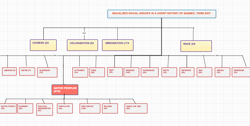
I must admit that I am absolutely inept at constructing diagrams. The only diagrams that seem to make sense to me are maps. While the visualization of the references to racialized social groups seem clear to me, I am sure this tree diagram may seem like a mess to someone else. If the tree diagram is supposed to present a concise diagrammatic representation of information, where did I go wrong (or right)?
Here is a breakdown of the information from the text:
| Chinese |
2 |
| Colonization |
2 |
| Immigration |
17 |
| race |
2 |
| Abenaki |
5 |
| Abitibi |
7 |
| Akwesasne |
2 |
| Algonguin |
7 |
| Attikamek |
1 |
| Cree |
8 |
| Erie (Native people) |
2 |
| First Nations (see Native people) | |
| Indian Act (1876) |
1 |
| Inuit |
5 |
| Iroquois |
14 |
| Kahnawake |
6 |
| Métis |
1 |
| Native People |
41 |
| Nipissing |
2 |
| Oka |
2 |
| Oneida |
1 |
| Onondaga |
1 |
Moretti reconfigures the tree diagram as a methodology for demonstrating “the interplay between history and form” (43). This is precisely why I decided that a tree may be an ideal medium to explore my contention with this particular history text. While the frequency of references are clear, as well as the sub-categorization of Native Peoples, I continue to feel that the tree does not articulate the lacuna of references to racialized peoples in a history text of Québec lauded to be the most comprehensive. We can see from the tree that there are a total of 106 references to Native/First Nations/Indigenous Peoples. There are no references to any other racial group other than Chinese (2 references). There is something amiss here…can the history of all other racialized groups fit neatly into the two references on race? While the numbers clearly explicate this situation, I continue feeling that the tree remains incomplete somehow.
Maybe the tree does not work alone..and must be juxtaposed with another three to references to other texts on racialized peoples in Québec—but the problem here is that these other texts generally do not factor into the discourse of Québécois history. I am concerned with the fact the A Short History of Quebec represents a very myopic presentation of racialized people in Québec.
In this bootcamp, I relied specifically on analyzing the index of A Short History of Quebec, and this source may present some insight into my dissatisfaction with my tree. The index of the text relies upon noting “important” keywords, however these keywords remain wrapped in a system of classification that may distort my understanding of the text. Moretti argues that a language tree “is a way of sketching how far a certain language has moved rom another one, or from their common point of origin” (46). In some ways, this tree is related to that language tree…but there is no indication of common points of origin, or history for that matter, only frequency. This issue of language and classification leads me to think about Deleuze’s image of the archivist. Who has given the archivist the power to organize the archive, to classify and name the documents? In relation to Foucault’s Archeology, Deleuze posits that “the words, phrases, and propositions examined by the text must be those which revolve round different focal points of power (and resistance) set in play by a particular problem” (Deleuze, “A New Archivist,” 17). I am not sure if the tree diagram I constructed summarizes the focal points of power (and resistance) I am attempting to address in A Short History of Quebec. Maybe the index has lead me astray, or maybe I simply need to take a workshop in graphs and diagrams…either way, I still think that it is clear that a “comprehensive” history text of over 400 pages should have more than two references to race.
Works Cited:
Deleuze, Gilles. “A New Archivist” Foucault, Trans. Hand, Séan. London: Althlone, 1988. 1-22.
Dickinson, John and Brian Young. A Short History of Quebec, 3rd Edition. Montreal: McGill-Queen’s University Press, 2003.
Moretti, Franco. “Graphs, Maps, Trees: Abstract Models for Literary History–3″. New Left Review 28 (July-Aug 2004): 43-63.
The post Bootcamp: Trees appeared first on &.
]]>The post Greenland is that large? Surveillance, Modernist Design, and Queering Cartography appeared first on &.
]]>Welcome to Montréal. This is Champs-de-Mars, one of the oldest places in the city.

This space is site to our fortifications, and once functioned as a military parade ground—now it stands a public park to invite millions of tourists to consume the history and beauty of the fair city. It was also one of the first sex cruising areas for a number of men in the early history of Montréal.
Champs-de-Mars remains to this day an important point of reference and meaning on almost all maps of Montréal, but you will rarely find the area designated as a site for history of cruising for tourists. This prompt is an application of the aim and strategies employed by JB Harley in the deconstruction of maps: in demonstrating that “[(scientific)] maps are not only the product of ‘rules of the order of geometry and reason’ but also the ‘norms and values of the order of social tradition.” (Harley 2) The assemblage of power and objective humanist reason in the construction of maps clearly exposes the aporias, blind-spots, and moments of self-contradiction that are endemic to the normative production of maps. We are required to engage with maps on an almost daily basis, whether it is using the metro or relying upon systematized directions through a Google maps application, but we rarely consider that “the mapmaker merely omits those features of the world that lie outside the purpose of the immediate discourse.” (Harley 11)
Please do not get me wrong, I love maps. I often find myself un/consciously constructing maps in my mind. One of the earliest memories I can recall involves a coffee brown-aged Vignelli New York City Subway map in my late grandmother’s sewing room; covered in faded pen ink, and folds and tears, all indications of her numerous journeys. Sometimes maps function as markers of physical locations, and other times they organize a network of memory, sense, and emotion. All together, these maps shape a personalized cartography of experience. Maps are social technologies as much as they also function as scientific diagrams of physical space, but this social connection to the technology is often mediated through discursive networks that result in “cartographers tell[ing] us [what] maps are supposed to be.” (Harley 1)
Let us consider the scientific diagrammatic accuracy in my grandmother’s Vignelli map that continued to remain on her wall decades after it was decommissioned by the MTA.
 Vignelli’s map continues to be an iconic example of maps, even in spite of the fact that it was completely against all scientific reasoning. When Vignelli was hired by the city to redesign the subway map in 1971, he was known principally as a designer, not a cartographer. His approach — simplicity through geometry — reduced New York City to its essence. Vignelli straightened out bent subway lines, reshaped the city, and even rearranged roads—this was emblematic of Vignelli’s message about New York City in the early 1970s, as a modernist city that operated along the logics of strict geometric lines. Harley asserts “rhetoric is part of the way all texts work and that all maps are rhetorical texts. We ought to dismantle the arbitrary dualism between…modes of ‘artistic’ and ‘scientific’ representation as they are found in maps. All maps strive to frame their message in the context of an audience.” (Harley 5) As much as many New Yorkers complained about the Vignelli map (I’m a New Yorker, we complain about anything), it was a popular success, and even more successful in manifesting the fault line between art and science in cartography. But also let’s admit it, we are consumed with tons of maps operative upon fallacious representations of space.
As a former high school history teacher in a NYC public school, I will reserve comment about the frustrations that I have with the lacuna of geographic literacy in education; however, we must bear in mind that the maps we utilized in schools across North America were not simply just off scale, but also completely ridden with imperialist rhetoric. The world map plastered across classrooms around Canada and the United States are just as wrong (or right) as Vignelli’s subway map. It’s clear that we need to follow Harley’s aim and really invest some effort in “challenging the epistemological myth (created by cartographers) of the cumulative process of an objective science always producing better delineations of reality.” (Harley 15) We must also understand that maps are not just often fallacious scientific representations of reality, but also a technology of power and surveillance.
How many of us have used Google maps today? How many times have you become a layer to the “scientific” representation of mapping in someone’s direction search today?
 I am still awaiting my disclosure contract from Google Street View, but at least I was caught simply fixing my cardigan, and not on Google Sightseeing with my trousers down to my knees. Google Street View has manifested the long standing connection between maps and surveillance. Just as a mapmaker omits features outside of the discourse, the mapmaker also constructs a spatial diagram that structure the mobility of subjects. If we are subjects under constant surveillance of maps, and even more so if we have the unfortunate luck of having our image embedded into the physical space represented in Google Street View, Vincent Chevalier’s Tumblr blog PWIF’d (Places Where I Fucked) may offer a possible intervention to this situation.

PWIF’d is a collection of screenshots assembled through Google Street View that chronicle the sexual experiences of the artist Vincent Chevalier during his time living in Montréal and travelling throughout Canada and the United States. Each screenshot in isolation has little to no significance beyond being a visual representation of a physical space. But we must also understand that physical spaces carry social meaning and emotional connections—how we we begin to map these discursive features that extend beyond the scientific rationalism of maps—Chevalier’s PWIF’d offers us some indications on how to begin this process. In placing the screenshots together in context of the blog, Chevalier essentially is constructing a map of his sexual experiences. His hashtags, which are derived from late 1990’s gay chatroom vernacular, operate has a map key to understand the information in the image and place it within context. While the images are not placed within a set spatial or temporal order, it would be possible to diagram these screenshots along one of these orders. But Chevalier does not seem concerned with these logics, rather PWIF’d is more reminiscent of “Mitford’s near stylization of rural space, however—with its alchemical transmutation of the ‘rough circle’ of work into a ring of pleasure—is not mentalité, but rather ideology: the world-view of a different actor (an urban visitor), whose movements duplicate the perimeter of rural mentalité, while completely reversing its symbolic associations.” (Moretti 85) Chevalier is that different actor queering the symbolic associations of the physical spaces documented in Google Street View—these sites have more meaning than simply a physical setting or structure. Maps are not simply about the distance between spaces/places, but also what these spaces/places mean in both isolation and in relation.
While it is certainly important to admit that a clear comparison between Ceretti’s map and PWIF’d not not entirely fair, as Ceretti utilized a pre-existing map of Paris as palimpsest, Chevalier’s map arguably is re-signifies the contextual and spatial meaning of the spaces shown in his blog. Outside of PWIF’d, a yellow house on the corner, a 1939 World’s Fair modernist housing development, a diner, or a bathhouse would have absolutely no relation whatsoever, there would be no significance to these spaces outside of their normative meanings and personal connections to individual places. Consider Claudio Cerreti’s map in the scope of Vincent Chevalier’s PWIF’d, where one could simply consider PWIF’d as a visual diagram of sexual experiences within ‘public’ and ‘private’ spaces within an urban context, we could simply also read PWIF’d as a geography of sexual experience, a map. I would argue against Moretti’s understanding Cerreti’s map as a diagram—I see both both to be maps in their own form, not simply diagrams on cartographic plane. While the forms of the object is heterogenous in this respects, they are still maps as both works offer both a social and ideological cartography. The form of of the map as object in this case is related to the forces that condition us to understand a map as a specific diagrammatic representation of area, not as a series of photographic representations of space with implicit and explicit performative uses. Moretti argues that the points in Cerreti’s map “seemed to be the premise of cartography, more than it’s result. Locations as such did not seem significant, if compared to the relations that map had revealed among them.” (Moretti 96) This is where I take issue with Moretti’s reading of Ceretti—in the same spirit with revisionist of history have come to understand that a date/event alone has no real historical meaning unless placed within a nexus of relations with other dates/events—I would argue that the location of the points on Ceretti’s map are more significant, as they reveal the living of space within a map.
Chevalier exposes a new possibility for mapping, a mapping that not only re-signifies spaces within a personalized cartography, but also points the marginalized spaces outside of the mapmaker’s discourse. This is where I feel that Jose Esteban Muñoz’s theory of performativity of disidentifications may prove useful to understand the importance of Chevalier’s project. Muñoz’s theory disidentification is a “response to the state and global power apparatuses that employ systems of racial, sexual and national subjugation.” (Muñoz 161). In Chevalier’s disidentification, he is resisting total co-option of the discourse of a map, by employing the map to deconstruct itself, and thus “elaborating forms of representation premised on invisibility” (Muñoz 166)—and it is through invisibility that Chevalier can survive surveillance in clear space. He subverts the delineation between public space and private acts in situating his sexual activities via Google Street View technology. This focus on the visuality of mapped space contains a potential for alternative social practices and is in constant negotiation between the different practices performed in the space. The power structures in the liminal area have not been fixed, and are therefore potentially flexible and not bound between a binary opposition. One could simply just read Chevalier’s project as a visual little black book or diagram of cruising spots, but these spaces subvert a public/private space dualism, as the the sexualized space isn’t per se a queer space. As actions are often taken by the dominant power structure to control and preferably eliminate the sexual activities, the place can become a battleground. It can be seen as an escape way from the maps and spaces of the everyday life, and is potentially where the conquering and defining of the space is not necessarily a struggle against the power and surveillance of the mapmaker’s discursive logics, but a personal action that provides a new vision of maps all together.
Works Cited:
“333 East 151st Street, Bronx, New York 10451, USA” Map. Google Maps. Google, 29 Oct. 2013. Web. 29 Oct. 2013.
“Champs de Mars” Image. Old Montréal, Sept. 2001. Web. 29 Oct. 2013.
Harley, Jacob. “Deconstructing the Map.” Cartographica 26.2 (summer 1989): 1-20.
Moretti, Franco. “GRAPHS, MAPS, TREES: Abstract Models for Literary History – 2″. New Left Review 26 (March/April 2004: 79 – 103
Muñoz, José Esteban, Disidentifications: Queers of Color and the Performance of Politics. Minneapolis: University of Minnesota Press, 1999.
Places Where I’ve Fuck’d – PWIF’d. http://pwifd.tumblr.com. Accessed: 29 Oct. 2013.
“West Wing – Why are we changing maps?”. YouTube. YouTube. 7 July 2008. Web. 29 Oct. 2013.
Yukie Ohta. “Massimo Vignelli’s 1972 NYC Subway Map” Image. Subway Series Part 2: Grid Locked. NewYorkBoundBooks.com, 2 March 2012. Web. 29 Oct. 2013.
The post Greenland is that large? Surveillance, Modernist Design, and Queering Cartography appeared first on &.
]]>