The post Boot camp: (In)Corporations of Fairy Tales in ABC’s Once Upon A Time appeared first on &.
]]>Moretti argues there is at least one “consequence of [the network model] approach: once you make a network of a play, you stop working on the play proper, and work on a model instead: you reduce the text to characters and interactions, abstract them from everything else, and this process of reduction and abstraction makes the model obviously much less than the original object” (4), leading me to wonder whether there’s value in the network model approach in folklore studies; is the network model appropriate for exploring and ideally illustrating the use of a fairy tale character despite and/or because of its specific placement in plot? What are the potential benefits of seeing folklore from a network perspective than from, say, the database of the ATU? For my boot camp, I decided to explore the potential of network diagrams with Once Upon A Time, which is of particular interest because of its constant allusions to Disney fairy tale films, and the dense network of fairy tale themes this move invokes.
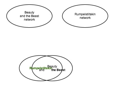
Fig. 1
In my first diagram, I attempted a simple and somewhat failed attempt to illustrate how Once Upon A Time combines two previously independent networks, or tales (fig. 1) – in this case, the previously independent tales of “Rumpelstiltskin” and “Beauty and the Beast.” However, this diagram only indicates that two tales overlap, and provides no supplementary qualifications for this relationship. After experimentation, I ended up with a Venn diagram to represent my network (fig. 2). This Venn diagram attempts, like Moretti, to “make visible specific ‘regions’ within the plot as a whole; subsystems, that share some significant property” (4). Venn diagrams comparatively evaluate data, which I use to demonstrate the “regions” of plot (that of “Rumpelstiltskin” and “Beauty and the Beast”) ABC constructs in Once Upon A Time’s narrative by sharing significant tale attributes (e.g. character associations).
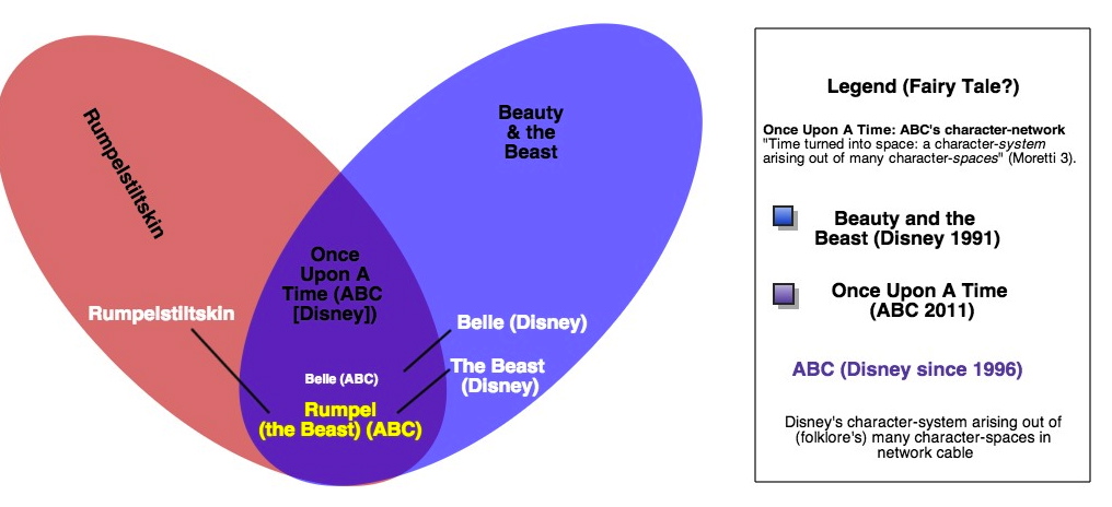
Fig. 2
Thus “Rumpelstiltskin” is also the Beast from “Beauty and the Beast.” But this narrative is further complicated with ABC’s explicit allusions to Disney’s version of Beauty, Belle, who shares the same name and attire as ABC’s live action version; “Rumpelstiltskin,” “Beauty and the Beast,” and Once Upon A Time collapse into each other under the umbrella corporation of Disney, owners of ABC since 1996. This Venn diagram ends up illustrating Disney’s corporate ownership of specific tale attributes (Belle) and ABC’s consequent (legal/legitimate) ability to manipulate Disney associations, simultaneously enacting folklore’s transformative gestures as well as corporatized indications of self-reference that actually paradoxically close off the network of folkloric associations in favour of expanding economic investment. In the densest part of the Venn diagram, we have the most convoluted manipulations of the folklore network for the consolidation of corporate ownership through cable network television.
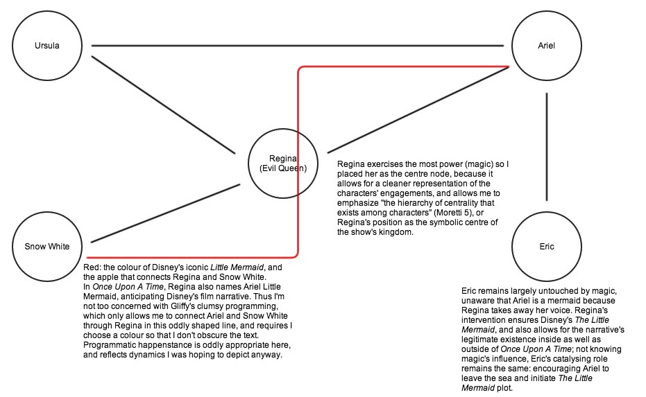
Fig. 3
This almost hegemonic assimilation of two or more tales continues and becomes a hallmark trope of Once Upon A Time. My third through fifth diagrams examine “Ariel,” the episode dedicated to “The Little Mermaid,” which unsurprisingly emulates the Disney version by referencing Ursula (unknown to the tale-type prior to Disney), Ariel (once again, Disney specific), and clothing the titular character in the same attire Disney created over a decade ago. In fact, “Ariel” is fascinating precisely because ABC capitalizes on Disney’s copyright ownership and elaborates upon The Little Mermaid while enabling its narrative: while Prince Eric appears in the episode, his knowledge of Ariel is minimal and can actually inform the movie’s catalyzing romantic plot;
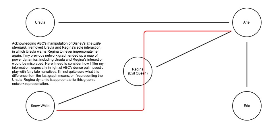
Fig. 4
prior to Regina’s (the Evil Queen from “Snow White”) impersonation of Ursula, Ariel believes Ursula is only a myth, and thus ostensibly would not have sought the sea witch out in the film if not for the knowledge Once Upon A Time imparts upon her; Regina actually names Ariel Little Mermaid, becoming ABC’s narrative consolidation as well as corporate nod to their parent company. Thus Regina is the centre node of my network diagram, because her character not only fuels the narrative with her machinations, but visually marks the centripetal structure of the corporate networks at work.
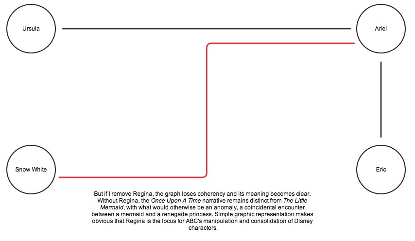
Fig. 5
“No interaction is crucial in itself. But taken together, they perform an essential reconnaissance function: they make sure that the nodes in this region are still communicating: because, with hundreds of characters, the disaggregation of the network is always a possibility” (Moretti 9). This is where suspicion informs my plotting of ABC and Disney networks: no interaction is crucial, but as the removal of Regina makes clear, the Evil Queen’s interactions are in fact crucial to legitimizing the combination of Snow White, the Little Mermaid, and even more tales in Once Upon A Time. The enforcement of Disney’s network through self-references legitimizes these fairy tales as Disney’s property, and “with hundreds of characters, the disaggregation of the network is always a possibility.” Thus, we have the Evil Queen, a tyrannical monarch who colonizes various tales under Disney(‘s)World, a self-enclosed narrative where transformations are only variations of their own copyrighted characters, and the transmission and transmutation of tales have shifted from the public sphere to the privatized corporate one. As much as my first diagram attempted to illustrate two previously closed-off networks opening affiliative possibilities, what my diagrams have made visibly evident is that these networks seem to have become increasingly more (in)corporated.
Works Cited
“Ariel.” Once Upon A Time. ABC. 3 Nov. 2013. Television.
Moretti, Franco. “Network Theory, Plot Analysis.” Literary Lab 2 (May 2011).
The post Boot camp: (In)Corporations of Fairy Tales in ABC’s Once Upon A Time appeared first on &.
]]>The post Boot Camp: My Sad Life, Quantified appeared first on &.
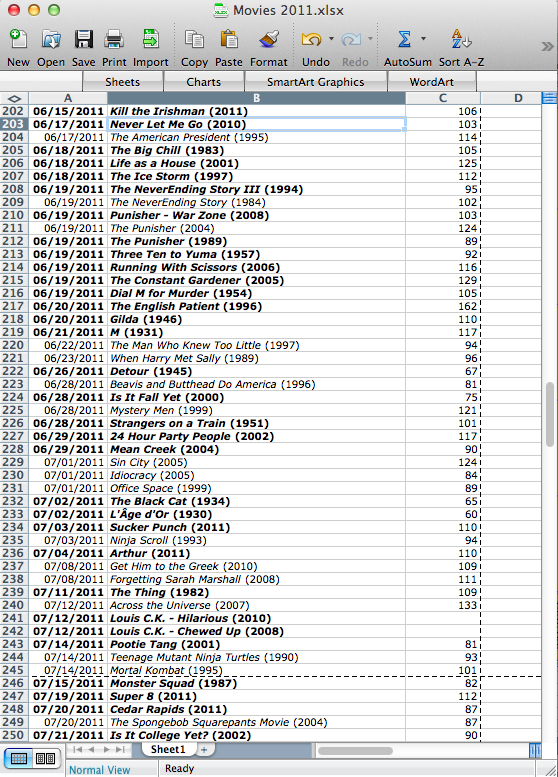
]]>Journalling takes us back some years to the emergence of the middle class, mercantiles documenting many of the more banal aspects of their day-to-day lives in keeping with the running of their households and businesses. Daniel Defoe elevated record-keeping to an art form with Robinson Crusoe, most of which is taken up in detailing inventories and explorations across the shipwrecked protagonist’s dessert island. At a certain point, personal archiving became the exclusive realm of those with the time and resources of a cosmopolitan upper class who knew they were already going to leave a mark on history: take for instance presidential libraries or Margaret Atwood’s meticulous preservation of everything she writes from manuscript drafts to correspondence to grocery lists. Today, everything is digital and automated, and the middle class is right back to journalling without even realizing it by way of life-hacking: we let apps and websites keep track of what we do in an effort to learn more about our own habits. Which brings me to me. Over the last few years, I’ve begun keeping track without understanding why. Earlier this year, my mother-in-law gave me a Fitbit One activity tracker that monitors my exertions, calorie intake and expenditure, and sleep quality; and since 2010 I’ve been using Shelfari to keep track of what I read (it used to be a lot of novels, and then I went back to graduate school and almost exclusively became theory and comics). But all of this is trumped by my great shame: for the past three years, I’ve been keeping a spreadsheet of all the movies I watch. And it’s a lot. (fig. 1)
(figure 1: a random sample of my movie watching habits. I could tell you a hundred things about how these records relate to each other)
Before I explain how this spreadsheet works, full disclosure: in the past 1,027 days (January 1st, 2011 to today), I’ve watched 951 movies. That’s not too embarrassing: it averages out to 1.079 movies a day 7.559 movies a week. Respectable, if only it was actually one movie a day and seven and a half movies a week. Instead, it ends up being zero movies some weeks and more than 20 other weeks. But I’m getting ahead of myself. The spreadsheet is simple: column A is the date I view a film, column B is the title and release year of the film, and column C is the film’s running time. A bold entry indicates if it was my first time seeing the film in question. In 2012, I start keeping a fourth column, D, that I mark if I saw the movie in theatres (in 2012 I saw 312 movies, only 12 of which were in theatres, and I didn’t start using Netflix until this summer, so I’m a dirty pirate). This chart alone is interesting to me, in that I can observe a thought process running throughout it: one actor or director leads to another, or seeing a particular genre film will remind of something along the same lines I haven’t seen in years. It’s a bit like Moretti’s flow of novel genre: some subtypes subtend toward others, which eventually supplant them.
It wasn’t until a few days ago that I realized I should be writing my boot camp exercise about my own movie-watching habits, so I scrambled to learn enough about Excel to turn this spreadsheet into a histogram (fig. 2):
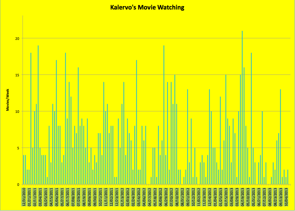
(figure 2: My movies per week for over 140 weeks. For a larger image click this: Kalervo’s Movie Watching)
It’s amazing what this chart tells me. I can connect huge spikes to times when I was doing a lot of writing or non-lit review research tasks (I like the background noise and must have ground through half of Hitchcock’s library writing a draft of my MA project in March of 2012), and I can connect drops to times in my life where I was otherwise occupied (the two biggest gaps are in late April of 2012, right after I finished my Master’s degree, and July/August of 2013, the month I got married). I can actually track major events, turning points, and trials in my life, just from the amount of movies I watched.
This was not easy. If the main point of these exercises is learn to do new forms of research, then the process of creating this histogram tells me a lot about how I should be doing things different in keeping my records, making my spreadsheet. For starters, Excel did not like the date format I was using. Getting around that took some time, and the first time I tried to put everything into a chart it came out a horrid mess (fig. 3):
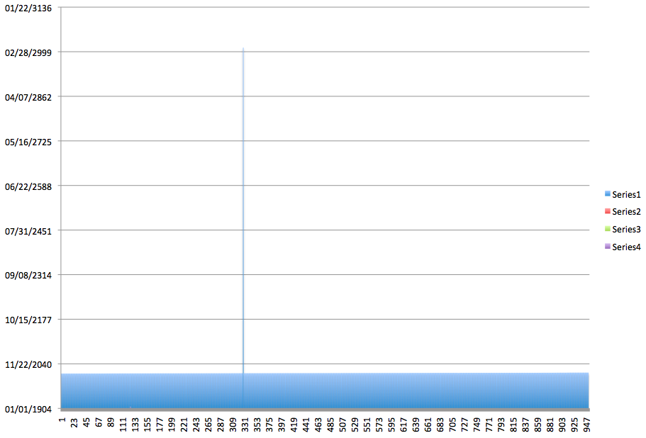
(figure 3: my first attempt at a chart. Note the date range: 1904-3136. What?)
Secondly, bolding entries for new movies is useless in creating a visualization: Excel doesn’t recognize bold. I should have had things separated out a whole lot more: One column for title, another for year, another for if it was my first viewing of the title. If I had had just two extra columns, virtually no extra effort in the moment I create the record (as I was already adding year and newness, just not in different columns), I could have known a host of new things, from the time of year (if any) I tend to see new movies to what release years my viewing habits tend to favour. I can go back now and do that, but what would have been cake at the time is extremely tedious to do all at once now. And if I’d been more diligent in recording running times, I could have visualized total minutes spent watching movies as well (though frankly I’m relieved not to be able to show you that). It also wouldn’t hurt me to jazz the infographic up a bit. I’m far from Nicholas Felton’s annual Feltron reports in my aesthetic (see featured image), and while up until now I’d always appreciated him as a graphic designer, I imagine he must have quite a bit of programming know-how too in order to predict the kind of things his programs would expect from him in terms of valid input. The demystification of the process is also remystifying: while I know now bolding entries was not helpful, I’m not sure the ideal value to put into my new column for newness.
In any event, I’m actually extremely impressed by how useful this record can be about telling you about me. In quantifying myself and my habits, I also quantify a corpus of texts according to my own biography. And while I hold no illusions that I’ll be interesting for future generations of scholars, it gives an organizing principle to my every action. Everything we do when we journal and archive ourselves is imbued with extra meaning. How that meaning values for others is less important than the intrinsic value we can see for ourselves in our own lives lived.
The post Boot Camp: My Sad Life, Quantified appeared first on &.
]]>The post Government Info-Tech Research Officer “Track[s] Emotions in Novels and Fairy Tales” appeared first on &.
]]>Maybe we should chat about this:
“Empirical assessment of emotions in literary texts has sometimes relied on human annotation” but now an algorithmic “system determines which of the words exist in our emotion lexicon and calculates ratios such as the number of words associated with an emotion to the total number of emotion words in the text” for novels, Shakespeare, and Brothers Grimm fairy tales (pp. 2, 3). There are no references to Franco Moretti, literary criticism and critical theory, or precedents in fairy-tale analysis such as the ATU Index. Google’s n-gram corpus data and visualization software, which allows you to “Search lots of books” (as opposed to a specific number? are we simply drawing lots? from the “mind of God,” as a Google co-founder once famously called Google), is the Script/ure used (examples of Google data visualizations here).
NRC author Saif Mohammed sees a bright future for the technology in affect surveillance: “Ultimately, he thinks emotion-based software may help us better keep tabs on depression or online harassment and bullying, track emotions on Twitter to forecast riots and better deploy resources, or measure sentiment towards government policies and controversial issues.”
The post Government Info-Tech Research Officer “Track[s] Emotions in Novels and Fairy Tales” appeared first on &.
]]>The post Getting Graphic: Representing Representations in Humanities and Sciences appeared first on &.
]]>Preview:

Source: Randall Munroe, XKCD
INTRODUCTION: GOOGLING GRAPHS
A Google search for the prompt “graphs are…” yields the following results: the best way to summarize data, visual representations of what, everywhere, often constructed from tables of information, and what of relationships. These fragmentary results illustrate the various approaches to graphs by different fields of research and institutional practices, as well as common conceptions regarding their purpose and value. In the article “Graphs, Maps, Trees,” Franco Moretti argues for a quantitative approach to illustrating literary trends; a shift from hermeneutic practices around individual texts to a quantitative analysis of literature (67). Introducing graphic displays of literary information exposes the field of literary studies to the questions aforementioned, not only is the question what the display shows but how and why its modality functions and what are the implications regarding power relations. What are the politics of graphing and how do they relate to the respective fields of humanities and sciences? Why does quantitative analysis in literature warrant such a “revolutionary” sentiment?
LITERARY LIKENESS: GRAPHS IN HUMANITIES
In “Graphs, Maps, Trees” Moretti employs a combination of line and bar graphs to illustrate his empirical analysis of the rise and fall of the novel. “Figure 1: The rise of the novel, 18th to 20th century” depicts increases in literary production in Britain, Japan, Italy, Spain, and Nigeria over 300 years with specific clustering effects (Moretti 69).

Fig. 1 Source: Franco Moretti, “Graphs, Maps, Trees”
Moretti introduces the scholars whose data will provide the basis for the graph at the start of the section two, several lines before referencing Figure 1 in text and a page before the actual illustration (68-69). The contextualization then appears before the reader encounters the graph, and is repeated in the figure caption which also lists the sources, as is captured by Figure 1 above. This reiteration of source material provides an emphasis on validity and traditional scholarly methods, that by referencing accepted scholarly work the author’s own hypothesis or statement is by connection authorized as well. Joseph Bensman discusses the elitism of footnotes whereby one must cite another scholar who is “equal or higher in prestige” in order to gain legitimacy (450), the data sources for Moretti’s graph work similarly. The graph and its data sources connote power relations precluding contradictions and complexities of authorship and authority, as power exerts its forces in humanities research through the figure of the Author-god. Bensman states that “footnotes have important institutional, “political” and aesthetic functions” (443); similarly these functions are also influenced by and through the graphs presented. The aesthetics as well as the political functions assert the graph’s authoritative dominance, Moretti uses a quote from lauded scholar Roland Barthes to champion the removal of the subjective from his analysis and thus this quote corroborates the quantitative analysis methodology (69).
BATTLEDOME: SCIENCE VS. ARTS
Moretti states that “graphs are not models; they are not simplified versions of a theoretical structure in the way maps and (especially) evolutionary trees” are (72): graphs are relations. Moretti both supports and contradicts this thesis with his own graphs; although they do illustrate relations between the numbers of books produced and the books’ locations, the accuracy as well as the reliance on traditional scholarly validation subverts the radical claims. Cosma Shalizi criticizes Moretti’s methods, arguing that Moretti should have analysed the data himself and mathematically calculated the probabilities for clustering occurrences and errors (118). This argument represents the burgeoning issue of transplanting quantitative analysis methods from science based research to literary practices. If Moretti’s data sources are proven wrong, or if his methods are found faulty then his argument for literary quantitative analysis can be refuted. An example of traditional scientific graphs is found in Figure 2, taken from a scholarly paper on Higgs modelling, a scientific phenomena which, as the paper attempts to prove, can be adequately imagined through specific microscopic structures called crystal lattices (Siringo 5880).

Fig. 2 Source: Fabio Siringo and Luca Marotta “Nonperturbative Effective Model…”
Regardless of its scientific meaning, the graph connotes several key statements which illustrate the shortcomings and successes of Moretti’s quantitative analysis. The line graph uses the caption to describe the phenomena and its graphic representation, it does not refer to outside sources for validity of previous results. Secondly, error is factored into the illustration by the size of the data points as well as the predicted function (the dashed line). By encrypting the graph with secondary information that is accessible through the primary study, the scientific graph elucidates the conceptualization process, turning to transparency for validation and allowing the reader to deduce its value rather than relying purely on precedent research.
Yet the scientific graph reinforces power relations by assuming the reader is adhering to the conventions of reading graphs, for example understanding that larger data points mean more possible error. Audience influences the output, the graph and caption describe sets of social relations and systems, discursive sets in a Foucaultian sense. In Andrew Piper’s article “Reading’s Refrain: From Bibliography to Topology” he suggests literary topology, which analyses the text not through hermeneutics but by assigning values to the lexicographic elements and represents them visually, signals an inspection of places in which literature intersects with other types of social strata and discursive readings (394). The inability to escape power relations through graphs, both in the humanities and sciences, highlights the connection between the process of academic research, Authorship (as in the panoptic) and social rules. Moretti hypothesizes that “quantification poses the problem… and form offers the solution” (86) which can be compared to concept of literary topology. Literary topology, as Piper illustrates in the Goethe graph, performs a similar function to work of Moretti’s graph, preferring quantitative data to the interpretative techniques (385), exhibiting shifting power relations between Author and reader that allow the reader more authority. This also is present in the scientific article, as form is contextualized later in the Higgs paper, when the discussion reveals the equation for the line graph and its derivation, evoking specific associations to fields of study and popularized theories. Therefore the graph summarizes the data while reflecting the environment in which it was constructed, physically from the digital program which produces the equation to the politics of theory behind the illustration.
HYBRIDIZATION STATION
Moretti’s graph attempts to convey more than one set of data results, i.e. more than one line segment. The results represent a comparison between countries and publication numbers, yet temporally they do not provide a cohesive linearity and further inference on the part of the reader is required. The article “Fingerprint Matrices: Uncovering the dynamics of social networks in prose literature” examines inter-character relations and compares these relations between novels, such as The Queen’s Tiara by Carl Jonas Love Almquist and J.K. Rowling’s Harry Potter and the Philospher’s Stone. Although the articles’ subject matter is slightly different, both propagate quantitative analysis of relations as the main analytic form; the graphs included illustrate the shift in methodologies and as such Piper’s concept that topology is the analysis of ratio rather than difference (379).

Fig. 3 Source: D. Oelke, D. Kokkinakis, and D. A. Keim, “Fingerprint Matrices”
“Fingerprint Matrices” presents material in a radically different graphic form than in the Moretti article, it uses matrix graphs to visual social networks. Ratio is “knowledge of the relational and the scalar, the co-presence of difference” (Piper 382); this is witnessed in the Harry Potter matrix graph which highlights the relationships between characters as well as their placement within the novel and subsequently their importance in the plot. With multiple goals the graphing structures must change as the two dimensional line graph used by Moretti is no longer able to display the information, and thus fingerprint matrices (as seen in Figure 3) are created instead (Oelke 372), becoming visualizations of text.
Alongside the fingerprint matrices are the researcher’s methodologies and background sections. The latter section (which cites Moretti) again displays the typical academic posturing, however it is more concise than previous essays examined. The methodologies section describes data collection, processing and graphic output, something which is markedly absent from Moretti’s section two-Figure 1 relationship. Piper states “when we read topologically we are reading our way through language’s historical entanglements,” (Piper 378) therefore the fingerprint matrices not only examine the repetition of Harry Potter characters, but the changes in research illustrations and performs a conjoining of theory and criticism (Piper 389). By producing a methodology whereby all its mechanisms become pellucid the validity of traditional research in humanities changes. No longer do the citations hold substantial authoritative power, but the empirical data and its representations are available for the reader to evaluate the efficacy of the results. Therefore the modifications of the mechanism and its display alter the researcher’s writing as well as the traditional outline of literary articles, which now use methodology and discussion section headings.
Conversely, the opposite argument can be made, that the articles modify the methods; these texts are located in digital domains. All three graphs outputs are digitally rendered, the scientific graph and fingerprint matrices both disclose the graphing procedures which use programs to sift and organize data. By analyzing the pixilation of the lines and the familiar settings of LaTEX, Moretti’s graphappe ars to be constructed via computer program. Digital graphs now require the reader to examine new elements, such as the efficiency of graphing programs or the image resolution in order to discern veracity and value. A further discursive set creates the authoritative relations between journals and readers, another power relation that highlights the function of graphs in scholarship. Currently these articles are available online through Science Direct and the Arts and Humanities Databases, which limits use to university affiliations yet still disseminates the material to a larger audience than through paper production. As quantitative analysis opens more possible readings to literature, the ‘entanglements’ of objects grow; the graphs emphasize the rules of literary production and character relations, rather than the meaning and the objects themselves, reflecting the increased multiplicity of articles and journals available. This perhaps addresses Piper’s question “what does it mean to read electronically?” (373); digital reading utilizes electronic resources and thus makes conscious our academic practices of reading in humanities research. Ultimately more questions remain, those still left unanswered include: how do these academic objects move through popular culture? Where are the intersections between fields of research in regards to graphing techniques? Does digital production of methods alter the function of research?
Works Cited
Bensman, Joseph. “The Aesthetics and Politics of Footnoting.” International Journal of Culture, Politics, and Society 1.3 (1988): 443-470. Web.
Munroe, Randall. “Tall Infographics.” XKCD.com. October 4, 2013. Web. October 19, 2013.
Moretti, Franco. “Graphs, Maps, Trees.” New Left Review 24 (Nov-Dec 2003): 67-913 Web.
Oelke, D., D. Kokkinakis and D.A. Keim. “Fingerprint Matrices: Uncovering the dynamics of social networks in prose literature.” Eurographics Conference on Visualization 32.3. Ed. B. Preim, P. Rheingans and H. Theisel. Oxford: Blackwell Publishing, 2013. Web.
Piper, Andrew. “Reading’s Refrain: From Bibliography to Topology.” English Literary History 80 (2013): 373-399. Web.
Shalizi, Cosma. “Graphs, Trees, Materialism, Fishing.” Reading Graphs, Map, Trees: Responses to Franco Moretti. Ed. Jonathan Goodwin and John Holbo. Anderson: Parlor Press, 2011. 115-139. Web.
Siringo, Fabio and Luca Marotta. “Nonperturbative Effective Model for the Higgs Sector of the Standard Model.” International Journal of Modern Physics A 25.32 (2010): 5865-5884. Web.
The post Getting Graphic: Representing Representations in Humanities and Sciences appeared first on &.
]]>The post Probe: Phonographs, Maps, Carpentrees appeared first on &.
]]>When it comes to listening to vinyl, NYC artist Rutherford Chang antithesizes what Franco Moretti identifies as the “typical reader of novels” in Britain up to about 1820 (Moretti 71). Instead of “a ‘generalist…who reads absolutely anything, at random’” (Moretti 71, quoting Albert Thibaudet), Chang listens to and collects anything, mostly at random, of a very specific corpus: copies of just one edition of one album, “the Beatles[’] first pressing of the White Album” (Paz np). To exhibit and expand this collection, which currently stands at “693 copies” (out of the over three million copies that comprise the 1968 “limited edition”), from January to March 2013 Chang occupied “Recess, a storefront art space in SoHo. It’s set up like a record store…and visitors are invited to browse and listen to the records. Except, rather than sell the albums, I am buying more” (Paz np). While there, Chang listened to White Albums all day, “recording the albums and documenting the covers” (np). Each record, being vinyl, bears its own record of needleworked grooving; many a cover, being once famously white, has been personalized with doodles. These covers Chang “put up on the ‘staff picks’ wall” – a topographized supercut. As for the records, “[a]t the end of the exhibition, I will press a new double-LP made from all the recordings layered upon each other. It will be like playing a few hundred copies of the White Album at once, each scratched and warped in its own way” (np). In the meantime, Chang released a preliminary effort onto SoundCloud, “White Album – Side 1 x 100”: one hundred White Album Side Ones playing simultaneously.
On what scale is Chang’s a scalar reading project? How does a noisy audio palimpsest multiplying “one” object compare with the pristine genre-spanning graphs of Moretti or the intricate Göethe-corpus topologies cited by Andrew Piper?
It’s tempting to dismiss Chang’s White Album remix as simply the synchronic equivalent of a less sophisticated “vernacular” of distant-reading like the supercut. But Ian Bogost’s proposal that object-oriented ontologists need to graduate from the logocentrism of writings which do ontology in theory, to the carpentry of crafted objects that put ontologies into practice (e.g. 91-2), suggests that graphing-objects similarly needn’t be constrained to the logo-visual. Can the “palimpsest” component of Chang’s clearly praxis-oriented project be considered, then, as “auditorizing” data in the same way that one of Moretti’s graphs visualizes data? A pertinent question, given “today’s growing interest in the field of information visualization” (Piper 388).
After all, what is graphic representation? “Graphing,” as the etymology suggests, is a form of writing, which is a form of drawing. As Piper points out, “Friedrich Kittler’s argument, of the two-thousand-year-old antipathy between the alphabetic and the numerical[,]” is a “false notion” (380). Nonetheless, the invisible Cartesian latticework gridding any typeset page, into whose discursive position of “prose” most writing gets indifferently wrapped, has continuously disarticulated graphemic writing from the genre of alphanumeric graphical representation. Notably the same, however, cannot be said for music. From its earliest forms, well before Descartes and de Fermat, the musical staff makes little secret about its dimensionality: pitch vs. time. But: “non-musical” texts encode sound no less! They, too, graph sounds against time, within a limited repertoire of graphemes (e.g. 26 letters vs. 12 tonic pitches). Thus, while literary analysis may have preoccupied itself with “the two-dimensionality of the page or the three-dimensionality of the book” (Piper 383), its broader problem has been that it would not even have articulated its conceptions of the page and book as such, for only recently has it begun to consider its objects in dimensional terms whatsoever. Meanwhile, graphing (alphabetic writing) and graphing (alpha-numeric charting) and graphing (musical scoring) have remained distinct. And a musical graph is expected to be performed aloud, with the body, whereas a philosophical or statistical graph is expected to be performed in silence, with the head. Cartesian plane indeed.
Sound, in short – by which I don’t mean speech – has been systemically excluded as a medium for philosophy, let alone for demonstrative data representations, and this has everything to do with philosophy’s logocentric tradition in emphasizing content over form, music being strongly articulated to the latter. But if we re-articulate the above various forms of writing as graphings more broadly, can we then likewise re-articulate any performance of a graphing as itself a form of graphing, even if this performance is sensually other to the visual (as the iconized data of Piper and Moretti, despite their iconoclasm in other respects, tends to emphasize)?
Things become clearer if we elaborate further on what graphing (i.e. writing) is, and illustrate with vinyl. In Vilém Flusser’s description, “writing…was originally an act of engraving. The Greek verb ‘graphein’ still connotes this…. [T]o write is not to form, but to in-form, and a text is not a formation, but an in-formation” (Roth 26). It is such information that we find grooving a vinyl record: a form of information whose curves, unlike these graphemes that I type, is more readily articulable to the curves of information that discourse has arbitrarily distinguished as graphing (see Figs. 1 & 2). Indeed, confusions have arisen at all because we speak of information in such logocentric terms as Flusser himself does, whereas information theorists speak of it in terms of waves, frequencies – something that writers like Piper do evoke with statements like, “any textual field is at base a configuration of differential repetitions” (394). Whereas, now that we’ve re-articulated graphing as information, we can see how the curves of Figure 2 could just as easily be transfigured into audio as could the curves on the vinyl. It would be up to us listeners to re-articulate our logo-visual biases to interpret the “audiograph” as well as we can its visualized score. But is it just our lack of familiarity with interpreting an “audiograph” as a graph that would other it as comparably “messy” (in John Law’s term), or can such graphs simply not compare with pristine Cartesian visuals, say for reasons of transfiguration?
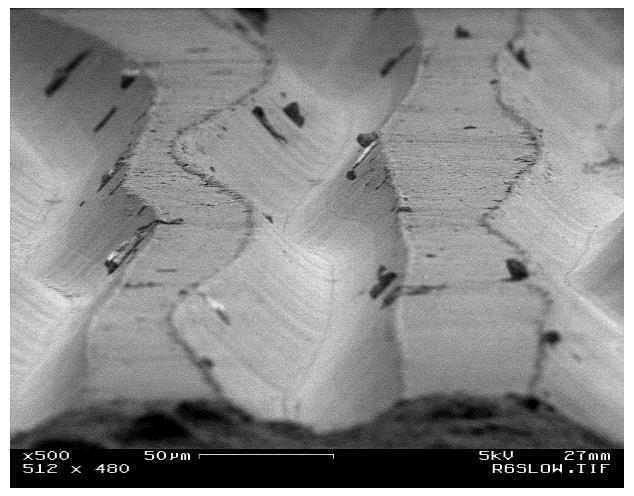
FIGURE 1: Close-up of record grooves
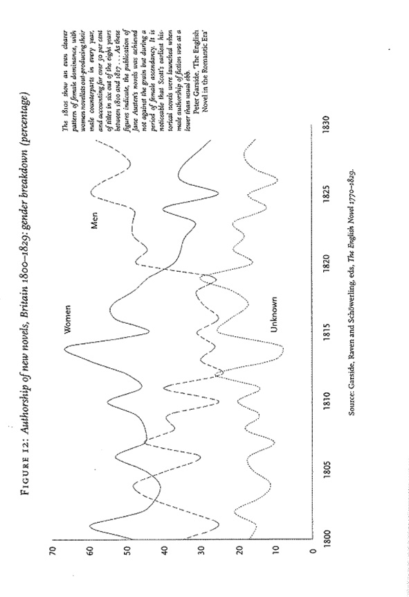
FIGURE 2: The grooves of Moretti’s record
The approach to this question is rolled up in what the convergence of Figures 1 and 2 illustrates: the zero-point at which “distant” and “close” break down into “a continuous spectrum of focalization” (Piper 382). This is a useful place to begin discussing Chang, whose “1 x 100” audiograph intuitively seems more of a “distant reading” than the audiograph from a single record. But, having dismissed the distant-close binary in favour of an ontology of surface relations, we shall see that “more” no longer necessarily means more, nor “less” less. If all graphs record regularities of information, then the question becomes not about perspectival proximity, nor even exactitude, but about how and what each object – 1 White Album vs. 100 White Albums simultaneously – graphs differently. What do the regularities of one single White Album measure in comparison with the overlayed regularities of one hundred White Albums?
Close-distant reading: We needn’t hear 100 versions at once for us to know that our single copy is not singular, that the “object” we listen to is much larger than its packaging’s pretense to unity; indeed, the fact that it is not one-of-a-kind is likely how and why we and the object found each other in the first place. For Foucault, the very fact that we have a White Album playing at all means that it is discursively sanctioned, corresponding to a discursive statement, a regularity within a field of discourse: the grooves of a single White Album already graph a regularity concerning White Albums. Like the statement “QWERTY,” produced by a standard keyboard, any printing of a White Album is a statement produced by a similarly standardized mass-printing device programmed to print the White Album from a “master” copy or image, such that any single vinyl record graphs a regularity of discourse, a record of the process of inscribing White Albums with the grooves that constitute White Album-ness. A White Album graphs, more accurately than its hundred-fold multiplication, the pristine Gaussian “mean” of White Album articulation. Mass production’s claim to mass identity is its mass delusion, but an individual album is nonetheless a graphical index of its mass-media ur-stamp. Indeed, this is so because it is such standardization’s goal: to distribute the closest approximation of the Same, so that a claim for Sameness may be made, a common-place created.
Distant-close reading: What do the 100 albums played at once tell us, then? We needn’t listen to know that there will be much “noise”; indeed, judging by the present recording, if Chang carries through with his plan to mash up his 600+ records, we would hear nothing but noise. What, then, does this audio-topography do? Ostensibly it graphs the relative fluctuations between 100 versions – but not in any distinct way. Can we distinguish all the tracks (and their interrelations) as we might in a visual representation? Indeed, there is “noise” because there is information lost – each element in the audiograph interferes with every other. Or is the noise we perceive as much a function of our bias to the logo-visual? If for topology “the ‘object’ is merely the identification of a visual thickness” (Piper 384), then Chang’s project fits the description, but does this hold if topology considers “reading” only as “a deeply visual experience” (Piper 387, emphasis added)? Alternatively: Friedrich Kittler engages in an alien phenomenology of the phonograph to describe its recordings as constituting the real: “The phonograph does not hear as do ears that have been trained immediately to filter voices, words, and sounds of noise; it registers acoustic events as such. Articulateness becomes a second-order exception in a spectrum of noise” (Kittler 23). Such engagement raises the question: Is (topo)graphing unable to deal with acoustic events as such? Would the noise be better approached from the phenomenology of an alien object?
Works Cited
Bogost, Ian. “Carpentry.” Alien Phenomenology, or, What It’s Like to Be a Thing. Posthumanities. Minneapolis: University of Minnesota Press, 2012. 85–111. Print.
Roth, Nancy A. “A Note on ‘The Gesture of Writing’ by Vilem Flusser and The Gesture of Writing.” New Writing: The International Journal for the Practice and Theory of Creative Writing 9:1 (2012): 24-41. Web.
Kittler, Friedrich A. Gramophone, Film, Typewriter. Trans. Geoffrey Winthrop-Young and Michael Wutz. Stanford UP: Stanford, 1999. Print.
Law, John. “Making a Mess with Method.” Lancaster: The Centre for Science Studies, Lancaster University, 2003.
http://www.comp.lancs.ac.uk/sociology/papers/Law-Making-a-Mess-with-Method.pdf
Moretti, Franco. “GRAPHS, MAPS, TREES: Abstract Models for Literary History – 1”. New Left Review 24 (Nov-Dec 2003): 67-93. Web.
Paz, Eilon. “Rutherford Chang – We Buy White Albums.” Dust and Grooves: Vinyl Music Culture. 15 Feb 2013. Accessed 10 Oct. 2013. http://www.dustandgrooves.com/rutherford-chang-we-buy-white-albums/
Piper, Andrew. “Reading’s Refrain: From Bibliography to Topology.” English Literary History 80 (2013): 373-399. Web.
The post Probe: Phonographs, Maps, Carpentrees appeared first on &.
]]>